
Cumulative Layout Shift shows up when the page moves after the browser has already drawn it. In modern layouts, that usually happens because content, spacing, or sizing details arrive too late.
Images are part of the story, but they are only one part. The same kind of jump can come from fonts, ads, hydration, lazy loading, or a component that changes size after the first render.
That is why a page can look calm in staging and still feel unstable in production.
A layout that depends on late data or third-party scripts has to keep revising itself as the browser works through what it has already painted. The result is a page that appears to breathe when it should stay still.
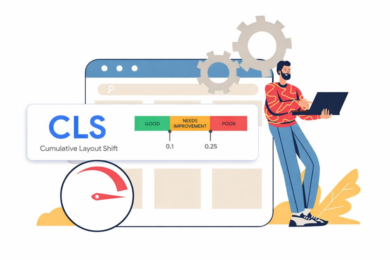
Cumulative Layout Shift in Modern Layouts
Modern pages are built from pieces that do not always arrive in the same order. Some content is server-rendered, some waits for JavaScript, some is pulled from an API, and some comes from a third-party network that may answer at its own pace.
Each delay creates a chance for the browser to make one decision and then replace it with another.
That is the practical side of Cumulative Layout Shift in modern layouts. The browser tries to draw quickly, which is a good tradeoff for speed, but it also means the first version of the page is often incomplete. If an element grows, loads, or swaps in after that first pass, nearby content has to move to make room.
Google’s Cumulative Layout Shift guide gives a clear definition of the metric, and the CLS optimization guide shows the standard fixes. Those pages are useful, but they do not fully capture how the problem appears inside a live site with ads, widgets, responsive breakpoints, and client-side rendering all at once.
In practice, layout stability is not just about one image tag or one missing size attribute. It is about whether the browser can trust the shape of the page before everything finishes loading.
Cumulative Layout Shift from Late-Loading Content
The biggest shifts usually come from content that arrives after the page looks done. Ad units are a familiar example, but they are only one piece of the picture.
Cookie banners, chat widgets, newsletter popups, recommendation blocks, embedded social posts, and similar inserts can all move the page if they appear inside normal document flow.
When that happens, the problem is not only the content itself. It is the space around it. If a banner appears above the article, the article gets pushed down.
If a widget expands after load, the section below it loses its position. If an embed loads with a height larger than expected, the rest of the page shifts along with it.
This is one reason field data often looks worse than lab data. A local test may use fast assets, cached scripts, and tidy sample content. Real traffic brings slower devices, wider text, longer headlines, and a more varied mix of scripts. The page is no longer working with fixed conditions. It has to absorb change while the user is already looking at it.
For ad slots and embedded content, a reserved space is usually the cleanest answer. Fixed dimensions, stable placeholders, and containers that do not grow after paint help the browser hold its position.
The Chrome guide on CLS culprits is useful here because it focuses on the kinds of elements that often move after the first render.
It is easy to underestimate how small changes add up. A few pixels from a banner, a few more from a font swap, a little more from a widget loading late, and the page has already drifted enough for users to feel it.
Cumulative Layout Shift in Modern Frameworks
Frameworks such as React, Next.js, and Vue bring a different set of layout problems. The server sends markup first, then the client hydrates it, then components update as state, data, and user context become available. If the rendered result changes between those steps, the page can jump.
That shift is often subtle. A timestamp may render one way on the server and another in the browser. A logged-in view may contain a slightly different card than the anonymous version.
A client-only component may appear after hydration and change the size of the section around it. None of those cases looks dramatic in isolation, but they can still move nearby content enough to register.
Mobile adds another layer. Browser bars expand and collapse, viewport units behave differently across devices, and a layout that looks calm on desktop can shift on a phone when the address bar changes height or a sticky element resizes. That is especially noticeable in pages that lean on full-screen heroes, percentage-based heights, or aggressive responsive rearrangement.
Font loading can also be a quiet source of movement in framework-heavy sites. If the fallback font and the final font have different metrics, text wraps in a different way after the swap. A heading that fits on one line at first can become two lines later, which changes the height of the block and pushes the rest of the page.
For pages built with modern frameworks, the safest pattern is consistency. The server and client should aim to render the same shape, the same spacing, and the same container sizes whenever possible. Where that is not possible, the layout should already hold room for the final version.
How to Reduce Movement in Production
Start with the elements that appear late. Give images explicit dimensions or an aspect ratio so the browser can reserve the right amount of space before the image arrives. Do the same for video, embeds, and any card that loads from another source. If a block can grow, decide that size before it shows up instead of after.
Then look at anything that inserts itself above existing content. Fixed positioning or overlay behavior works better than a flowing element when the component does not need to reshape the page. That approach is often better for consent notices, chat tools, and small interface panels that would otherwise push the main content around.
Fonts deserve a separate check. A close fallback match reduces line-wrap changes, and modern font loading settings can soften the swap. If a typeface change is altering line height or word wrapping, the shift will show up somewhere below it even if the text itself looks fine.
From there, check client-side rendering and hydration. When server output and client output disagree, the browser has to patch the page. That patch may be small, but it can still shift nearby elements. Keeping the same markup path on both sides is one of the cleanest ways to avoid that kind of movement.
Finally, test with real page behavior, not just idealized test data. Open Chrome DevTools, record a reload, and watch the Layout Shift Regions overlay.
The places that flash are the places worth inspecting. You can also compare that with field data in tools built around Core Web Vitals, such as the Core Web Vitals overview, to see whether the same patterns show up for actual users.
Cumulative Layout Shift in modern layouts is rarely caused by a single obvious mistake. It usually comes from several small timing problems stacking on top of each other. A page becomes unstable when it keeps changing after the browser has already committed to a shape. Once that pattern is visible, the fixes are usually straightforward: reserve space, keep rendering consistent, and stop late content from rewriting the page.


