
When a person opens a page, the tiny details of how the page appears and reacts shape their whole impression. Core Web Vitals are a shorthand for three useful signals that describe what people actually experience: how fast the page shows its main content, how stable the visuals are while things load, and how quickly the page responds when someone taps or clicks.
For designers, these signals translate directly into choices about layout, images, fonts, and how much JavaScript the page runs before it becomes usable.
Designers tend to think in pixels and motion; Core Web Vitals translate those visual and interactive choices into measurable outcomes.
That doesn’t mean design becomes a checklist. Rather, the metrics give a practical language for decisions that already matter to how you compose pages.
What Core Web Vitals Measure and What to Look for
Core Web Vitals are three user-focused measurements:
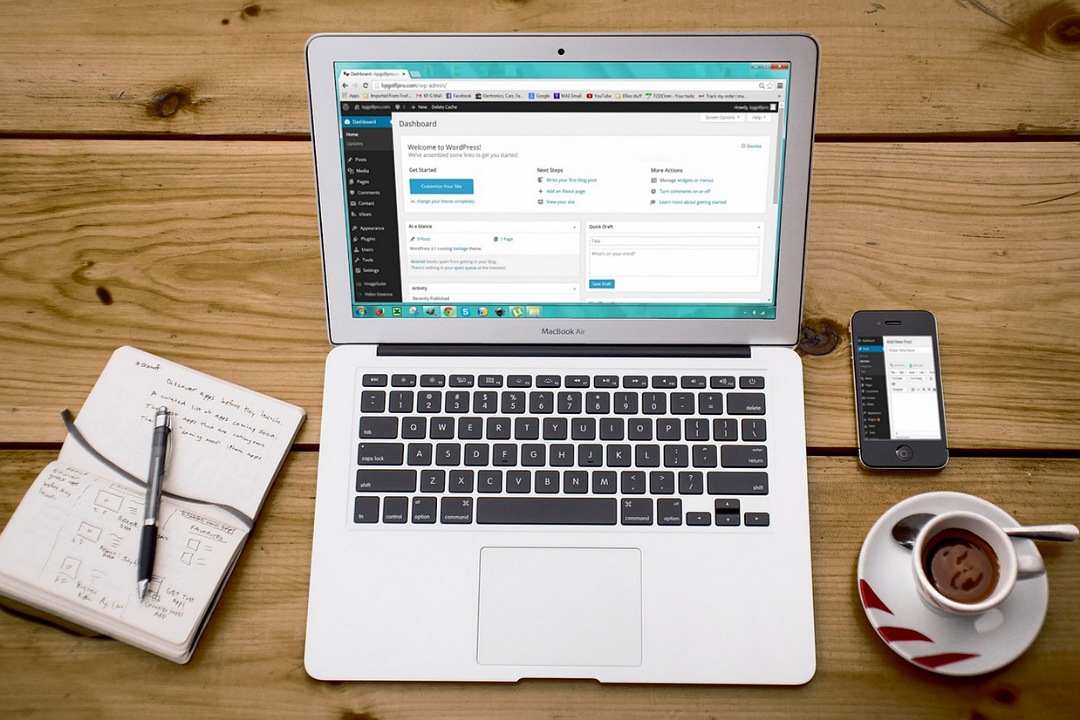
- Largest Contentful Paint (LCP): roughly when the main content in the viewport finishes rendering. Designers should think about the hero area, headline, and principal image: those are often the LCP elements.
- Interaction to Next Paint (INP): how long it takes the page to respond to user input across the lifecycle of the page. For designers, this reflects whether a tap or click feels snappy or sluggish.
- Cumulative Layout Shift (CLS): the total of unexpected visual shifts that happen as resources load. When buttons jump or text moves while you’re trying to tap something, that’s a layout shift.
Those three measurements come from how people actually use pages, not from simulated tests alone.
For practical design work, the important thing is to spot where a layout or interaction choice creates friction and to remove that friction with small, focused fixes.
Core Web Vitals for Designers: LCP, INP, CLS
LCP: Making the Main Thing Appear Quickly
Design is often about hierarchy: what should the eye land on first. LCP rewards clear hierarchy and efficient loading.
If your hero section is an oversized image, the browser must fetch and paint that image before users perceive the page as “ready.” A handful of design-centered tactics help:
Choose an image crop that matches the viewport and supply appropriately sized files so the browser doesn’t download a massive photo for a small screen.
Use responsive srcset so devices get the right image resolution. Designers can produce art-directed crops for different breakpoints rather than relying on a single image scaled with CSS.
Consider a simple, lightweight placeholder or a subtle gradient that gives the layout shape while the real image loads, but reserve space for the image so the page doesn’t shift dramatically when it arrives.
I redesigned a local café’s landing page where the hero image was a full-width high-resolution photo. Swapping to an art-directed crop for mobile and using a medium-quality WebP for phones cut perceived load time in half.
INP: The Feeling of Responsiveness
INP is about how interactive a page feels. Designers influence this through the number and type of interactive elements and how they’re wired up.
Some practical design choices are:
- Avoid heavy animations or heavy DOM updates tied to simple interactions like opening a menu or toggling a filter. If the animation requires large JavaScript work, the click will pause while the browser handles that script.
- Keep interactive targets (buttons, links) simple: if a button click triggers a long synchronous operation, the UI should show immediate feedback (disabled state, spinner) while the heavier work runs asynchronously.
- Defer non-essential scripts so the main interactive layer is ready before ads, tracking, or large widgets initialize.
- Use lightweight event listeners: avoid attaching multiple listeners to the same element when one delegated listener can handle everything. Fewer listeners mean quicker response time for taps and clicks.
- Prioritize CSS for simple effects: transitions, states, and visual feedback should rely on CSS whenever possible so the browser’s rendering engine can handle them efficiently without blocking interactions.
When I worked on an e-commerce product page rebuild, we replaced a synchronous “add to cart” handler that ran validation and DOM rewrites immediately with a lightweight immediate UI update followed by background processing. The change made the button feel instantly responsive on low-powered phones.
CLS: Preventing Jumps and Wobble
Nothing breaks trust faster than a button that moves under your finger. CLS is the aggregate score of unexpected layout shifts; designers can prevent most of them with disciplined layout habits.
Simple rules designers can adopt:
- Reserve space for images, embeds, and fonts. Explicit width/height or aspect-ratio keeps the layout steady while the resource loads.
- When injecting content (ads, promotional banners, or lazy-loaded modules), pre-allocate the space. If ad slots can’t be filled immediately, leave a neutral placeholder rather than pushing content down when the slot becomes active.
- Use
font-display: swap; test whether the fallback-to-webfont swap causes layout changes and, if necessary, adjust sizing or line-height.
Design Patterns that Commonly Create Problems, and How to Avoid Them
Some recurring patterns in design workflows are surprisingly expensive for perceived performance:
- Huge hero images served at full resolution to all devices. Solution: prepare art-directed images and deliver them via
srcsetor an image CDN with automatic format selection. - Splash screens or loaders that block the page. Solution: prefer progressive reveal of critical UI and only use blocking loaders for absolutely necessary app initialization.
- Third-party embeds (widgets, chat, analytics) loaded early. Solution: lazy-load or isolate third-party elements so they don’t block or compete with the main UI.
- Heavy icon libraries or full UI kits shipped for just a few components. Solution: extract only the needed icons/components or switch to a lightweight alternative so the browser parses less code.
- Oversized JavaScript bundles that load before the page becomes usable. Solution: split the bundle and load only the critical parts upfront while deferring everything else.
- Animations or transitions triggered before layout is stable. Solution: wait for the initial layout to settle and use CSS-based animations so nothing blocks the first interaction.
These are not calls to remove polish but to choose where polish should appear first. The user’s first glance and first interaction are the most fragile moments; if those feel solid, everything else can be layered on gradually.
Collaboration: What to Ask for at Handoff
Designers don’t ship alone. A few clear requests at handoff cut a lot of back-and-forth and keep the visual vision intact while preserving performance:
- Provide image specifications for each breakpoint, including crop and focal point.
- Ask developers to preload the font(s) used in the hero if the font choice is essential to the brand moment, or design fallbacks that match metrics closely.
- Define placeholders for dynamic content (ad slots, embeds) so front-end code reserves space.
- Specify acceptable animation durations and when to use transforms versus layout-affecting properties.
Measurement and Continuous Design Tuning
Design decisions should be observable. A few practical approaches for ongoing tuning:
Use field metrics to understand real user experience; tools like Google’s PageSpeed Insights and the Chrome UX Report show how pages perform in the wild.
Instrument your pages with a lightweight metrics script so you know which pages and which devices show the worst experience.
Run an experiment: change one design variable (reduce hero image size, reserve ad space, or tweak font-weight) and compare the change in the field. Small experiments are cheap and reveal which design choices actually change user behaviour.
Final Note
Design is an act of framing: you decide what deserves the first look, the first click, the first engagement. Core Web Vitals don’t replace taste, craft, or judgment; they translate the first moments of that craft into language teams can use. A tidy image crop, a reserved ad slot, or a modest animation change can make the interface feel far more humane.
